Sunday, September 27, 2009

2adpro

The place where i am working....

2adpro is a leading graphics design provider that offers a complete range of creative services from concept to execution. We provide a virtual creative studio for our customers to meet all of their advertising, marketing and other creative needs. Studios are customized to meet each customer’s individual requirements. Our customers include media companies, advertising agencies, large enterprises and small business. Our unique on-demand service delivery model is designed to create a flexible solution to meet the unique needs of each of our customers.

Friday, September 25, 2009

http://mkdramesh.typepad.com/

Hi - I am on typepad.,,,,,.......................
http://mkdramesh.typepad.com/

www.mkdramesh.in

hi check out my new web site ... www.mkdramesh.in ...

Monday, June 15, 2009

IQ


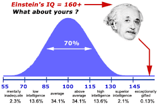
Inittially my IQ was 91 and now it is 109 - which is close to above average...

Intelligence & Interval Cognitive Designation
40 - 54 Severely challenged (Less than 1% of test takers)
55 - 69 Challenged (2.3% of test takers)
70 - 84 Below average
85 - 114 Average (68% of test takers)
115 - 129 Above average
130 - 144 Gifted (2.3% of test takers)
145 - 159 Genius (Less than 1% of test takers)
160 - 175 Extraordinary genius

Friday, June 12, 2009

Technical Writing: Common Page Design

Page design means different things to different people, but here it will mean the use typographical and formatting elements such as you see in the table of contents for this chapter.

Our focus here is technical documentation, which implies more modest, functional design.

Headings

The following presents some of the standard guidelines on headings. For a more detailed discussion, see the chapter on headings in the online textbook.

  • With online information, you want to use a lot of headings, perhaps one heading for every two to three paragraphs. Of course headings can be overdone: lots of headings with only one or two sentences per heading does not work.
  • Design headings so that they clearly indicate their level. Use type size, type style, color, bold, italics, alignment in such a way that the level of the heading is obvious. ("Levels" of headings are like levels in an outline: first level would correspond to the roman numerals; second level, to the capital letters; and so on.)
  • Make headings descriptive of the sections they introduce. Headings like "Technical Background" don't tell anybody anything.
  • Make headings parallel in phrasing. Parallelism sends readers important clues as to whether the section in similar in nature to the preceding ones.
  • Avoid "lone headings" — it's the same concept as having an "A" without a "B" or a "1" without a "2" in outlines.
  • Avoid "stacked headings" — that's two or more consecutive headings without intervening text.
  • Avoid referring to headings with pronouns in the text following headings. If you have a heading like "Configuring the Software," don't follow it with a sentence like "This next phase..."
  • Consider using the "hanging-head" format to make headings stand out more and to reduce the length of regular-text lines. In the hanging-head design, some or all of the headings are on the left margin, while all text is indented one to two inches.
  • Consider using "run-in" headings for your lowest-level heading. It can be difficult to rely solely on type style and size to indicate heading levels. A run-in heading "runs into" the beginning of a paragraph and ends with a period. You can use some combination of bold, italic, or color for these headings.

Lists

Lists are useful tools for emphasizing important points, enabling rapid scanning of text, and providing more white space. The following presents some of the standard guidelines on lists. For a more detailed discussion, see the chapter on lists in the online textbook.

  • Use numbered lists for items that are in a required order or that must be referred to by number. Use bulleted lists for items in no required order.
  • Use standard numbered- and bulleted-list format. Use standard HTML tagging for these types of lists so that numbers use the "1." style; bullets are the standard large dot; there is an adequate indent from the number or bullet to the text; and run-over lines indent properly.
  • Make the phrasing of list items parallel.
  • Introduce all lists with a lead-in; don't use headings as lead-ins to lists.
  • Unless some internal style overrides, punctuate list items with a period only if they are complete sentences or have embedded dependent clauses.
  • Use either initial cap or lowercase on the first word of list items, but do so consistently.
  • For nested lists, use a bolded en dash for the bullet symbol in second-level list items; use lowercase letters for second-level numbered list items. Make sure that nested items align to the text or the previous level.
  • Avoid excessive use of lists of lists with too many items. Seven to ten items is generally considered about the maximum for lists. On a standard page, there probably shouldn't be more than two or three lists, and at least three or four lines of regular text should come between them.

Notices

Notices are those specially formatted chunks of text that alert readers to potential problems or danger. The following presents some of the standard guidelines for notices. For a more detailed discussion, see the chapter on notices in the online textbook.

  • Use a standard hierarchy of notices in which notices are more prominent and noticeable as they become more severe.
  • Consider using this hierarchy: danger notices for situations involving potential severe injury or fatality; cautions for situations involving minor injury; warnings for situations involving damage to equipment or data or threat to the success of the procedure; and notes for points of exception or emphasis not involving the preceding situations.
  • Whatever notice design you use, avoid extended text in all bold, all italics, all-caps, or combinations thereof.
  • In addition to telling readers to do or not to do something, explain what will happen if they ignore the warning, under what conditions to make use of the statement, how to recover if the statement is ignored.
  • Make the text of notices succinct, but not at the expense of clear writing. Avoid telegraphic writing style in notices.
  • In numbered lists, align notices to the text of the list item they apply to.
  • The standard wisdom of placing notices before the step in which the potential problem exists can cause problems in formatting. If possible, state warnings, cautions or dangers at the beginning of the entire procedure.

Tables

Tables a like vertical lists, discussed previously, but more structured and formal. In your text, look for repeating pairs, triplets, or quadruplets of items that can be formatted as tables. For example, a series of terms and definitions is a classic use for tables. The following presents some of the standard guidelines for tables. For a more detailed discussion, see the chapter on tables in the online textbook.

  • Look for repeating groups of items in your text that you can format as tables.
  • Use a table title unless the content of the table is utterly obvious and the table contains few items. Make the table title the top row of the table.
  • Use column and row headings (or both) to define the contents of the columns and rows. Consider using some sort of highlighting for these column and row headings.
  • Left-align text columns (unless they are simple alphabetic character items). Left-align text columns with their headings.
  • Right-align or decimal align numerical data, and center it under its heading.
  • Put standard measurement units in the column or row heading rather than with each item in the column or row.

Highlighting

Software documentation typically uses a lot of highlighting. Highlighting here refers to bold, italics, alternate fonts, caps, quotation marks, and other such typographical tricks used to call attention to text. The following presents some of the standard guidelines for highlighting. For a more detailed discussion, see the chapter on highlighting in the online textbook.

  • Establish a plan for use of highlighting, and apply it consistently. Use highlighting for specific, functional reasons. Avoid too much highlighting; avoid complicated highlighting schemes
  • Consider using this fairly standard highlighting scheme:
    • For simple emphasis, use italics.
    • Use bold for commands, on-screen buttons and menu options
    • Use italics for variables for which users must supply their own words.
    • Use an alternate font for text displayed on screen or text that users must type in.
    • For screen and field names, use the capitalization style shown on the screen but no other highlighting.
    • Use an initial cap for key names but no other highlighting.
    • For extended emphasis, use the notice format.

Margins, Indentation & Alignment

As mentioned in the section on headings, a nice touch is to indent text one to two inches while leaving headings on the left margins. This style does two things: it makes the headings stand out, and it shortens the line length of regular text. In many instances, lines on web browser are far too long to be comfortably readable. As a web page designer, you cannot ultimately control line length, but there are a few tricks you can try. You can use the "hanging-head" format in which all text is indented one to two inches while the headings remain on the left margin. You can also use the two-column variation in which headings are in a left column and text is in a right column.

Fonts & Color

On web pages, you can use color easily. Also, you can use whichever fonts your readers have available on their own computers. Obviously, you can't know which fonts readers have available to them, so you must choose the most common. Here are some suggestions concerning fonts and color:

  • Use only the most common fonts — some readers may not have the same fonts that you do.
  • Use only one alternate font, at most two. For example, you might use Arial for headings, Times New Roman for body text, and Courier New for text that displays on screen or that users must type in.
  • Be careful with smaller type sizes and unusual fonts — make sure they are readable on other computer systems. In particular, check the appearance on a Mac if you are using a PC and vice versa; check the appearance on Microsoft Internet Explorer if you are using Netscape and vice versa.
  • If you use color, use it minimally. For example, if you have black text on a white background, you might select another color for headings. You might use that same color for figure and table titles as well as the tags for notices (the actual "Note," "Warning," "Caution," and "Danger" labels on notices).
  • Again, as with fonts, check the alternate colors you've chosen on a variety of computer hardware to ensure its readability.
  • Avoid unusual combinations of background and text colors. For example, purple or red text on a black background is horrible to read. Stick with black text on a white or gray background unless there is strong function reason for some other color combination.
This content is also available in http://www.io.com/~hcexres/textbook/page_design.html

Online Technical Writing: User Guides

A user guide is essentially a book-length document containing instructions on installing, using, or troubleshooting a hardware or software product. A user guide can be very brief—for example, only 10 or 20 pages or it can a full-length book of 200 pages or more. While this definition assumes computers, a user guide can provide operating instructions on practically anything—lawnmowers, microwave ovens, dishwashers, and so on.

The more complex the product, the greater the page count. when this happens, some elements of the user guide get split out into their own separate volumes—especially the installation procedures, troubleshooting procedures, and the commands. A user guide can even contain a brief tutorial—for example, getting users started using the product—but if there is too much tutorial, it too goes into a separate book.

Style and Format for User Guides

A user guide is a combination of many things presented in this online textbook. At its core is instruction writing; you need to be good at the writing style, headings, lists, notices, highlighting, tables, graphics commonly used in instructions. (For an overview of these elements, see the page-design chapter in this online textbook.) As a set of instructions, a user guide should use the style and format that is presented elsewhere in this online textbook:

  • Headings—Use headings to mark off key contents of the information so that readers can find it quickly. See the chapter on headings for details on planning and designing headings.
  • Lists—Use numbered and bulleted lists to help readers scan information quickly. See the chapter on lists for details on planning and designing lists.
  • Special notices—Use special notices such as warnings, cautions, and notes to alert readers to potential problems or emphasize special points. See the chapter on notices for details on planning and designing notices.
  • Instructional design—In general, use the standard design of instructions; primarily, this means task-oriented headings and sections and numbered vertical lists for actual steps that readers are to perform. See the chapter on instructions for details on planning and designing instructions.

Instructions—and therefore user guides—also make abundant use of:

  • Graphics—Show readers key components of the objects they will be working with, before and after views, and illustrations of key actions that readers must perform. See the chapter on graphics for details on planning and designing graphics.
  • Tables—Provide statistical information and other such details in easy-to-access table form. In user guides, tables are particularly useful whenever reference-type information must be presented. See the chapter on tables for details on planning and designing tables.
  • Highlighting—Use a consistent and standard scheme of highlighting (bold, italics, alternate fonts, color, caps, and so on). See the chapter on highlighting for details on planning and designing highlighting guidelines.

Components of User Guides

As a book, a user guide must have some combination of the standard book-design components such as the following:

  • Front and back covers
  • Title page
  • Edition notice
  • Trademarks
  • Disclaimers
  • Warranties
  • License agreements
  • Safety notices
  • Preface
  • Appendixes
  • Glossary
  • Index
  • Reader-comment form

There is no standard combination or sequence of these elements; every company does it differently. Details on the contents, format, and design of these elements can be found in the book-design chapter.

Information Included in User Guides

Here's review the common contents of user guides:

  • Instructions—The most obvious are those step-by-step directions on how to assemble, operate, or troubleshoot the product. Instructions in user guide should generally be task-oriented—that is, written for specific tasks that users must perform. Instructions should generally use vertical numbered lists for actions that must be performed in a required sequence. Similar or closely related instructions in user guides should be grouped into chapters.
  • Precautionary information—You'll see notes, warning, caution, and even danger notices in user guides. These represent liability concerns for the manufacturer of the product.
  • Reference information—User guides typically contain plenty of reference information, but only up to a certain point. For example, if there are numerous commands, a separate book for commands is necessary. Reference information in user guides is often presented in tables: columnar lists of settings, descriptions, variables, parameters, flags, and so on.
  • Getting-started information—Some user guides will actually include brief tutorials that will help new users get acquainted with using the product.
  • About the product—User guides also provide some description of the product, a review of its essential features or its new features. Sometimes this information also gets put into a separate volume, if it is extensive. Typically, the volume will be called something like "Introducing New Product...."
  • Technical background—Sometimes, users guides will include technical explanations of how the product works, what physical or chemical principles are essential to its operation, and so on. For example, you will see considerable background in user guides for graphic or audio programs—you can't operate them without understanding the concepts of brightness, saturation, and hue; mu law, A law, and other such.

Examples of User Guides

Consider a few examples:

Delarina WinFax LITE User's Guide. This book is 5.5 × 8.5 inches and under 150 pages. It is uses by-chapter pagination, with new chapters and sections beginning on a righthand page.

  • Covers: On the front cover, you see the full book title, a version number, the company name with its logo, and warning that the book is not for retail sale. The back cover contains advertising material—rather atypical for user guides—on the product's best features, special offers on the full version, a 1-800 number to call, and the book number.
  • Title page: The first page inside this user guide is the title page, which includes the product name, the book title, the book edition number, the date of the edition, the company logo (which includes its name), several addresses for the company, and the not-for-retail-sale warning. The company name has a registered trademark symbol beside it; the product name has the trademark letters beside it. No trademark symbols are shown on the front or back covers.
  • Edition notice: On the back of the title page is the edition notice. This edition notice includes the book title, a copyright notice, legal statements concerning copying the book, list of trademarked product names occurring in the book, and the document number.
  • License agreement: On the next page is the software agreement, a two-page thing that outlines permitted uses of the software and related warranties.
  • Table of content: The TOC begins on a righthand page numbered "i" and lists up to level of headings within the chapters.
  • Headers and footers: The book title is used for both the left and right footers: on the left-page, the title is right-aligned; on the right-page, the title is left-aligned. The page number appears opposite of both footers, and a solid ruled line is placed just above both footers. The chapter title is used for the inside header on each page; the current heading is used for the outside header on each page. A solid ruled line is placed just beneath these headers.
  • Preface: The Overview which is treated as chapter 1. It contains some promotion of the product, a diagram of the product's many uses, hardware and software requirements on its use, an overview of the manual contents, and instructions on how to get help.
  • Body chapters: Chapters use the following design features:

    • Chapter title — Large bold Arial letters with the chapter title on the left margin and the chapter number on the right and a double ruled line below.
    • Headings — First-level headings are about 1 point smaller than chapter titles, left aligned, with a solid ruled line just below. Second-level headings are about 2 points smaller, left aligned, with no ruled line. Third-level headings are the same size as body text but use bold-italic Arial and are placed on the left margin.
    • Text — Body text is a serif font about 10 points in size. This manual does not use hanging-head format; text extends to the same left margin as do headings.
    • Graphics — numerous screen captures are used through the book; they are all centered.
    • Lists — Numbered lists are used for items in sequence such as steps. Open squares are used for bulleted items that have a subhead. otherwise standard filled disks are used as bullets.
    • Highlighting — Text that users must type uses a sans serif type (probably Arial) as do screen buttons, options, field names, and system messages. Bold is used for simple emphasis.
    • Notices — Only notes and hints are used. The word "Note:" or "Hint" uses bold-italics. The text of the notice is regular body font indented an inch.
    • Appendixes — The book ends with two appendixes: Appendix A addresses common problems with a situation/solution format; Appendix B addresses fonts. These pages are numbered A-1, A-2, . . . B-1, B-2, and so on.
    • Index — The book ends with a 10-page index whose page are numbered with lowercase roman numerals starting at i. The index uses the standard but does something unusual with entries. It uses a table-of-contents format for the entries and their page references, connecting them with the sort of leader dots you'd see in TOCs.

IBM Aptiva Reference Guide. This book is also 8.5 × 5.5 inches. It is uses consecutive page numbering throughout the book and is about 120 pages long.

  • Covers: The front cover has a graphic design with stylized numbered 1, 2, and 3 along with large grid pattern and various sorts of shading. The three elements of the book title are placed at the top, upper third and bottom of the area, respectively. You also see the words "information," "getting help," and "troubleshooting" seems to float between the second and third title elements, giving readers a more detailed sense of the book's contents. The back cover continues the grid pattern and includes the IBM logo with the part number of the book, its print date, a statement that the bopok was printed in th e"USA" and a bar code for the book number.
  • Title page: This page contains the words "Aptiva Reference Guide" is large serif letter in the upper right of the page—and that's it!
  • Edition notice: The edition notice occurs on the back of the title page. It is pushed to the bottom of the page and uses a smaller type size, probably 7-point, for its body text. The heading for the edition notice is the edition number followed by the month and year of th edition. The paragraphs of the edition notice states that the book is provided "as is" without any warranty, that the book is for multiple models of the product and that portions of it may not refer to the reader's own particular model. Also included are an address where comments can be sent, a 1-800 number to request additional copies, and the standard copyright line.
  • Table of contents: The TOC is an unusual design in which all entries are left aligned in the center of the page, with the page numbers to the left about an inch. First-level entries use bold. TOC begins on page iii.
  • Notices section: The first body section of this manual is for notices—specifically, trademarks, highlighting conventions used in the book, safety notices, and regulatory (communications) notices. The section begins with its own title page on which is displayed the word "Notices" in a large serif font in the upper right corner and with a grid/shading design similar to that on the front cover. The text of the notices section begins on a right-hand page as does the chapter title page.
  • Body text: Here are the key design features of the body text:

    • Text — Text for this book is indented nearly 2 inches. Body text is a rather small sans serif font, probably Helvetica, probably 9 or 10 points. The hanging-head format is used.
    • Headings — First-level headings align to to the far left margin, use a blocky bold sans serif font with a solid ruled line above. Chapter titles use a large gray serif font in the upper right corner of the first page of the chapter. Second-level heading align with body text, use sentence-style caps (as do first-level headings) and use the same font as do first-level headings but about 2 points smaller.
    • Highlighting — In stepwise instructions, the following elements are bold: buttons, tabs, menu options, menu names, keyboard key names, icon names, parameter settings. Names of disks supplied with the product are in italics. System messages are in regular roman and double quotation marks.
    • Steps — Instructions sequences are introduced with a gerund-phrased heading in the block bold font. Substeps or alternate subtasks use infinitive phrasing with the same font but smaller and are punctuated with a colon. Actual steps use a number in the same smaller font with out a period.
  • Headers and footers: Only footers are used. Bold page numbers (using the same font as the first-level heading but much smaller) are on the outside; the current heading, not chapter title, is centered and in a serif italics font using sentence-style caps.
  • Special notices: This book uses a light gray box with a white checkmark in it to call attention to special notices. the text of the special notices is the same as the footers: small italic serif font. Usually, the checkmark box is located on the far left margin and the notice text is aligned to the normal body text. Where possible, the checkmark box and the notice text is in the open area between the far left margin and the body text.
  • Troubleshooting section: The body of this section begin with a flowchart that must be meant to orient a user to the overall process of troubleshooting and to the different troubleshooting resources available. The next section consists of common questions with actions to take depending on yes or no answers. The text of the actions is bulleted or numbered depending on the content and contains cross-references to other areas of the troubleshooting information. The next section is designed in two columns, the left column with the heading "If the problem is.." and the right column with the heading "Here's what to do..." The problem statement in the left column is in bold. the next section is similar except that it lists error codes that are displayed on the computer and actions to take.
  • Index: The book has a 6-page index formatted in 3 column. Two levels of index entries are used. The page references are set about a half inch away from the text entries.

Process and Internal Documents for User Guides

An important part of user guides—in fact, of almost any technical document—is the process that produces it:

  1. Initial planning—Early planning on a user guide involves needs assessment (is any documentation needed at all?), audience analysis (who will be using the user guide; what are theiur needs?), task analysis (what will users use the product for; what are their common tasks?), library plan (what books, in addition to a user guide, are needed to support the product?), and so on.
  2. Documentation proposal—If you are working freelance or as part of an independent documentation firm, you may have to write a proposal in an effort to win a contract to do a certain technical documentation project.
  3. Documentation plan—User guides need documentation plans, which are internal supporting documents that specify content, audience, design, format, production team members, schedule, and other such information about a documentation project and its "deliverables." The documentation plan resembles the documentation proposal in certain ways, but the plan represents an established plan agreed upon by everybody involved in the production process (and that means both the user guide and the product it documents).
  4. Prototype and specifications—Important planning tools, which also serve as useful reference tools during a documentation project, include the prototype of the user guide and the specifications for the user guide. The prototype is a dummy version of the book with all planned components of the book (see the list on book-design components) and all planned elements (see the list under format and style). However, the prototype uses "greeked" text (also known as Lorem ipsum like the following, instead of real text:

    Lorem ipsum dolor sit amet, consectetuer adipiscing elit, sed diam nonummy nibh euismod tincidunt ut laoreet dolore magna aliquam erat volutpat. Ut wisi enim ad minim veniam, quis nostrud exerci tation ullam corper suscipit lobortis nisl ut aliquip ex ea commodo consequat. Duis autem vel eum iriure dolor in hendrerit in vulputate velit esse molestie consequat, vel illum dolore eu feugiat nulla facilisis at vero eros et accumsan.


    Typically, the prototype of the user guide is very brief: it need include only as many pages as it takes to illustrate every unique textual component and textual element that will be used in the user guide.

    Specifications are descriptions of a book design in table form. Specifications describe every unique component or element of a book, so that it can be recreated by someone who might not have access to the electronic files, templates or styles of that book.
  5. Template and style catalog—A well-designed user guide, and a well-designed process to produce that user guide, should include templates and style catalogs. A template is an electronic file that defines such aspects of the user guide as page size, headers and footers, page-numbering style, regular and special page layout, and other such detail.
  6. A style catalog is also an electronic thing that defines the format and style of textual elements such as headings, headers, footers, lists, paragraphs, tables, and so on. For example, a style for a "heading 1" might specify 24-point Arial bold with 24 picas above and 12 picas below. Styles help you create a user guide more efficiently; styles also help you maintain consistency in the format and style of that user guide.

  7. Multiple review drafts & sign-off—A good process for the production of a user guide also includes several drafts that editors, technical experts, usability testers, and documentation team members can review and provide comments on. You as writer then implement those comments and produce a new draft for these same people to review again. When everybody is satisfied with the draft of the user guide (or worn out or out of time), they sign off on the user guide, and it can then go into "production," which means producing the finished bound copies.

As you can see, a user guide brings together many of the topics covered in this online textbook. If you are taking a technical writing course, you probably cannot implement all these features and phases of a user guide. Get with your instructor to see which are required.

This content is taken from

http://www.io.com/~hcexres/textbook/user_guides.html >

User Guides

A user guide is essentially a book-length document containing instructions on installing, using, or troubleshooting a hardware or software product. A user guide can be very brief—for example, only 10 or 20 pages or it can a full-length book of 200 pages or more. While this definition assumes computers, a user guide can provide operating instructions on practically anything—lawnmowers, microwave ovens, dishwashers, and so on.

The more complex the product, the greater the page count. when this happens, some elements of the user guide get split out into their own separate volumes—especially the installation procedures, troubleshooting procedures, and the commands. A user guide can even contain a brief tutorial—for example, getting users started using the product—but if there is too much tutorial, it too goes into a separate book.

Below is the link which will direct you to the Online Technical Writing: User Guides

Read it and use it..

Thursday, June 4, 2009

http://www.albertministries.com/

http://www.albertministries.com/

Check out the website....

I am working on it. Trying to do search engine optimization...

Sunday, May 31, 2009

Trainers' Qualities

Exceptional Trainers are Different than So So Trainers; Engage Them

  • There is a vast difference between the exceptional or great trainers and the average or below average (the so so trainers).
  • It is hard to find the great or exceptional trainers. Organizations need to put in efforts to locate the right trainers.
  • Generally, organizations are tempted to employ or contract the so so trainers since they charge much less than the exceptional trainers.
  • But training employees the right way is a serious business and organizations should not act penny wise pound foolish.
  • Employees' training is a long term investment whose returns are enormous only if the trainees are exceptionally trained.
  • And that is possible only by training your employees under the guidance of exceptionally great trainers. Even if their professional fees are far more than the so so trainers, it is prudent to invest in that kind of trainer with that kind of professional fee because of very high returns on this investment.
  • Winning team is always trained by an ace coach.

Qualities of Exceptional/Great Trainers

  • Has generosity of sharing his knowledge with the people.
  • Feels happy in development and growth of the people he trains.
  • Comes fully prepared for every session.
  • Practices delivery of his sessions.
  • Has complete mastery over his subject knowledge.
  • Exudes authority in his subjects.
  • Exudes confidence about himself.
  • Exudes enthusiasm.
  • Creates a conducive environment for learning.
  • Motivates learners to learn.
  • Creates a conducive environment for teaching.
  • Knows his audience very well.
  • Sets out the objectives of the sessions and the take aways by the trainees.
  • Designs and develops the syllabus as per the learning needs and audience profile.
  • Organizes the session plan effectively.
  • Delivers the topic in simple to understand and simple to retain manner for every participant.
  • Is a very good communicator.
  • Maintains the authenticity of the topic throughout his delivery.
  • Facilitates learning with lots of creativity.
  • Is adept in all the training methodologies like lectures, discussions, case study, role play, management game, sensitivity training, introspecting questionnaires, individual and group exercise, question-answer.
  • Uses the modern technology hardware and software for teaching with ease.
  • Promotes active learning by eliciting learners' participation.
  • Encourages questions from the audiences and provides correct and satisfactory answers.
  • Maintains patience with the learners.
  • Is empathic towards the learners.
  • Maintains discipline and decorum in training sessions.
  • Is result focused. Makes sure that objectives of the training sessions are met.
  • Ensures that the learning can be easily implemented by the trainees in their professional and personal life.
  • Does not brag about himself to the audience.
  • Does not please the audience just for getting popularity or to make them feel good.
  • Willing to appreciate different viewpoints on the subject matter he teaches from audience and from various other people and then deliver the subject in the most authentic way.
  • Brings in humor in the session occasionally if appropriate or pertinent and infuses lightness in the session but never makes mistake of using the session as a jokes telling session.
  • Adheres to the time management of the session.

IQ Test Scores: The Basics of IQ Score Interpretation

IQ stands for intelligence quotient. Supposedly, it is a score that tells one how “bright” a person is compared to other people. The average IQ is by definition 100; scores above 100 indicate a higher than average IQ and scores below 100 indicate a lower that average IQ. Theoretically, scores can range any amount below or above 100, but in practice they do not meaningfully go much below 50 or above 150.

Half of the population have IQ’s of between 90 and 110, while 25% have higher IQ’s and 25% have lower IQ’s:

Apparently, the IQ gives a good indication of the occupational group that a person will end up in, though not of course the specific occupation. In their book, Know Your Child’s IQ, Glen Wilson and Diana Grylls outline occupations typical of various IQ levels:


140Top Civil Servants; Professors and Research Scientists.
130Physicians and Surgeons; Lawyers; Engineers (Civil and Mechanical)
120School Teachers; Pharmacists; Accountants; Nurses; Stenographers; Managers.
110Foremen; Clerks; Telephone Operators; Salesmen; Policemen; Electricians.
100+Machine Operators; Shopkeepers; Butchers; Welders; Sheet Metal Workers.
100-Warehousemen; Carpenters; Cooks and Bakers; Small Farmers; Truck and Van Drivers.
90Laborers; Gardeners; Upholsterers; Farmhands; Miners; Factory Packers and Sorters.


Who am I. My IQ is 91... ok... where did i end up... There are few things we will never understand...
I am a Stenographer, a Trainer, and tomorrow... DESTINY...

No one can change your DESTINY...

Jai Ho...

Tuesday, May 26, 2009

kirkpatrick's four levels of training evaluation

This grid illustrates the basic Kirkpatrick structure at a glance. The second grid, beneath this one, is the same thing with more detail.
level evaluation type (what is measured) evaluation description and characteristics examples of evaluation tools and methods relevance and practicability

1 reaction

* reaction evaluation is how the delegates felt about the training or learning experience
* eg., 'happy sheets', feedback forms
* also verbal reaction, post-training surveys or questionnaires
* quick and very easy to obtain
* not expensive to gather or to analyse

2 learning

* learning evaluation is the measurement of the increase in knowledge - before and after
* typically assessments or tests before and after the training
* interview or observation can also be used
* relatively simple to set up; clear-cut for quantifiable skills
* less easy for complex learning

3 behaviour

* behaviour evaluation is the extent of applied learning back on the job - implementation
* observation and interview over time are required to assess change, relevance of change, and sustainability of change
* measurement of behaviour change typically requires cooperation and skill of line-managers

4 results

results evaluation is the effect on the business or environment by the trainee

* measures are already in place via normal management systems and reporting - the challenge is to relate to the trainee
* individually not difficult; unlike whole organisation
* process must attribute clear accountabilities

the four levels of learning evaluation

Donald L Kirkpatrick, Professor Emeritus, University Of Wisconsin (where he achieved his BBA, MBA and PhD), first published his ideas in 1959, in a series of articles in the US Training and Development Journal. The articles were subsequently included in Kirkpatrick's book Evaluating Training Programs (1975 and since revised), published by the American Society for Training and Development (ASTD), for whom Kirkpatrick previously served as president and with whom he maintained strong connections. Donald Kirkpatrick has written several other significant books about training and evaluation, more recently with his similarly inclined son James, and has consulted with some of the world's largest corporations.

Donald Kirkpatrick's 1975 book Evaluating Training Programs defined his originally published ideas of 1959, thereby further increasing awareness of them, so that his theory has now become arguably the most widely used and popular model for the evaluation of training and learning. Kirkpatrick's four-level model is now considered an industry standard across the HR and training communities. The four levels of training evaluation model was later redefined and updated in Kirkpatrick's 1998 book, called 'Evaluating Training Programs: The Four Levels'.

The four levels of Kirkpatrick's evaluation model essentially measure:

* reaction of student - what they thought and felt about the training
* learning - the resulting increase in knowledge or capability
* behaviour - extent of behaviour and capability improvement and implementation/application
* results - the effects on the business or environment resulting from the trainee's performance

All these measures are recommended for full and meaningful evaluation of learning in organizations, although their application broadly increases in complexity, and usually cost, through the levels from level 1-4.

Monday, May 25, 2009

mkdramesh is now on newsvine

see more learn more... a new approach from mkdramesh (ok its me)

Seed Newsvine

Sunday, May 24, 2009

Kartharukkul CROSS TALK


ICON Centre for Training & Career Advancement Private Limited

Seminar on Technical Writing

Hi All

Af ter a long time, a seminar was conducted by me for Technical Writers. The topic was little bit wired. Visual communication for Technical Writers.

It was a great Saturday at ICON, with 12 people attending the seminar. The best part was that i was showing the attendees Captivate, the tool which i love to use.

Audience Feedback: Workshop made Technical Writers feel really worth of it.

Mileage: More Enquiries for Advanced Technical Writing module

Thaks to ICON for giving me this opportunity.

Ramesh

Animating a Sky

Tuesday, May 19, 2009

mkdramesh

Sunday, March 29, 2009

LOVE - to my Soul mate

My love for you is ever so strong.
I feel so right, i know it can’t be wrong.
I know I’ve done a lot of things wrong.
I punish myself for what I’ve done to you.
I really regret doing so, i wish all that wasn’t true.
Baby lets take a walk back in time,
and cherish all those memories,
when everything was fine.
The world changed since you left me,
I’ve changed since you left me.
The sun never set,
the moon never rose.
I still remember the time.
when we were close.
My love for you is the same since the first day i met you.
how i wish time just stopped,
time just stopped the moment,
i first saw you.
time just stopped,
the moment you said you love me,
the moment i heard you.
Please tell me again you still love me,
Please tell me you miss me.
When i cry,
tears of blood run down face.
My heart aches for you in every beat.

Tuesday, March 17, 2009

My Crush

So, wondering about the song lyrics. OK they are my favourite song lyrics.

These are evergreen songs. They remind me my past ----. :) rest is too personal to discuss.

Keep guessing...

I have got you?

Baby when I think about you
I don't need to think cause I just know
That baby it's the way you love me
That's make me so damn sure that you're the one
Don't you know that I've waited for you
Your everything I've wanted all my life
Never thought I would find what I need
Till you came along my dream seemed far away
I can be with another girl and I can take a trip all around the world
But why would I go anywhere when I've Got You
I can spend my money on fancy clothes meet a thousand women doing videos & shows
But baby I'm so glad that I've Got You
Maybe I just got lucky
Cause a chance like this don't come around everyday
Can we hold on to what we've got if I ever lost you girl my life would change
You should know that your love gives me strength
And without you I don't know where I would be
It's because of you I'm soul at ease
No matter where I am I'm not alone

I can be with another girl and I can take a trip all around the world
But why would I go anywhere when I've Got You
I can spend my money on fancy clothes meet a thousand women doing videos & shows
But baby I'm so glad that I've Got You
All that I have is nothing when it compares to you
And I can't believe how your love makes me feel
I'm glad that I've Got You and girl you've got me too

I can be with another girl and I can take a trip all around the world
But why would I go anywhere when I've Got You
I can spend my money on fancy clothes meet a thousand women doing videos & shows
But baby I'm so glad that I've Got You

You Sang To Me lyrics

I just wanted you to comfort me
When I called you late last night you see
I was falling into love
Yes i was crashing into love
Of all the words you said to me
About "Life," "The Truth," and "Being Free"
Yeah you sang to me
Oh how you sang to me
Girl I live for how you make me feel
So I question all this being real
Cause I'm not afraid of love
For the first time Im not afraid to love
This day seems made for you and me
And you should me what life needs to be
Yeah you sang to me
Oh you sang to me

All the while
You were in front of me
I never realized
I just can't believe
I didn't see it
In your eyes
I didn't see it
I can't believe it
Oh but I feel it
When you sing to me
How I long
To hear you sing
Beneath the clear blue skies
And I promise you
This time I'll see it
In your eyes
I didn't see it
I can't believe it
Oh but I feel it
When you sing to me
Just to think inside of me
I had no idea how this could be
Now I'm crazy for your love
The words you said just sang to me
And you showed me where I wanna be
You sang to me
Oh you sang to me

Something Stupid

I know I stand in line
Until you think you have the time
To spend an evening with me
And if we go someplace to dance
I know that there's a chance
You won't be leaving with me

Then afterwards we drop into a quiet little place
And have a drink or two
And then I go and spoil it all
By saying something stupid
Like

I love you

I can see it in your eyes
That you despise the same old lines
You heard the night before
And though it's just a line to you
For me it's true
And never seemed so right before

I practice every day to find some clever
lines to say
To make the meaning come through
But then I think I'll wait until the evening
gets late
And I'm alone with you

The time is right
Your perfume fills my head
The stars get red
And oh the night's so blue
And then I go and spoil it all
By saying something stupid
Like

I love you

I love you...

Monday, March 16, 2009

How to get over your crush?

So, you have a crush on this person, and you truly believe that he / she is one of a kind. But your crush(he/she) does not reciprocate your feelings and has no romantic interest in you. It hurts you and bothers you on many levels.

After harboring a hope that your crush will eventually like you or even fall in love with you for some time, you realize that the chances of the two of you getting involved romantically are dismal. But it still hurts - you still want to be with that person so badly. At the same time you realize that the right and the healthy thing for you to do is to get over him / her once and for all.

But it’s easier said than done. I want to suggest to you one powerful, five-step approch to getting over your crush permanently:

1. Realize that what you experience is an emotion, and as such it will take time to get over it. No one tip or advice will change how you feel in an instant. Only a conscious, continuous effort, lapse of sufficient time and patience on your part will allow you to fully recover from what you feel right now.

2. Stop harboring hope and imagining how great it would be spending time with your crush. Doing this only aggravates your condition and does absolutely no good to you. It's like opening a wound that just started healing. Do not do it.

3. Stop thinking that the person you have a crush on is one of a kind. It's NOT TRUE. No matter how highly you think of him / her, there WILL be other people in your future that will be unique and speical in their own way, and this what will make you fall in love with them.

4. Refocus your attention and get busy. This is not that time to spend too much time alone and dwell on your situation. Pursue other romantic prospects, spend time with other people who are positive, supportive and funny, and pursue your professional, educational and social goals. Keep yourself busy to prevent boredom, because when boredom kicks in, all the negative, weak thoughts return to your mind.

5. Above all, remember: getting over the present crush will help you deal with similar situations in the future that will likely come and will make it much easier to get over a crush and move on with your life as a stronger, happier person, who is ready to rule the world.

Sunday, March 15, 2009

Kartharukkul Cross Talk

This is my all time favourite Music: Listen and comment:


Pls don't copy.

Friday, March 6, 2009

Adobe Flash CS4


Today, I had the opportunity to work in Flash CS4.

Oh my goodness, its god trajectory like feature and bones for character animation.
That is awesome

Adobe calls these features as Time-savers

Let me list few of these :

Fine-tune animations fast Time-saver

Adjust simple Bezier curves to control changes between keyframes. What once required painstaking hours of work has been made faster with this single easy-to-use panel.

Save hours of work with prebuilt animations
Select from dozens of presets or create and save your own. Share presets with others to save animation time.
That’s cool guys. Working with Flash is never going to be the same.

The Constant Gardener

I loved watching this move. Hope you enjoy it too.

British diplomat in Nairobi, is told that his activist wife, was killed while traveling with a doctor friend in a desolate region of Africa. Investigating on his own, the diplomat discovers that her murder, reportedly done by her friend, may have had more sinister roots.


He uncovers a corporate scandal. KVH (Karel Vita Hudson), a large pharmaceutical company working under the cover of AIDS tests and treatments, is testing a tuberculosis drug that has severe side effects. Rather than help the test trial subjects and begin again with new medicine, KVH covered up the side effects reported in the tests, and only improved the drug in anticipation of a massive, multi-resistant tuberculosis outbreak.


As he begins to piece together the final report on the fraudulent drug tests, he learns that the roots of the conspiracy stretch further than he could have imagined; to a German pharmawatch NGO, an African aid station, and most disturbingly to him, corrupt politicians in the British Foreign and Commonwealth Office.

Sunday, March 1, 2009

Outliers


Gladwell:


Have you read this book. I just happened to come accross this book by Gladwell. The book is titled Outliers - The story of success. There is a topic on remembering and practicing things and it says for a person to master some thing (or to become like A. R. Rehman) you need to outpass other masters in that particular field and practice nearly for 10,000 hours.

My suggestion on that would be to practice even more than that. So that you become unconsciously competent.

Check the below blog for more details on Outliers and Gladwell.

http://gladwell.typepad.com/gladwellcom/2008/11/outliers.html

Saturday, February 28, 2009

Kasi - Getting Married on March 8, 2009

Hi Kasi
Wish you a happy married life.

Kartharukkul CROSS TALK

I have had the pleasure of listening to the songs of Kartharukkul CROSS TALK by Albert. Wish him all the best. Albert you have done a marvellous job. Listening to the songs let me comment on album Kartharukkul Cross Talk by Albert.

Each and every song is impeccable and Albert's voice is awesome.
Albert's speech is the best part of the album. Listening to the song should bring discipline to the youth, the need of the hour, for the country and for the Global peace .

With Original Lyrics, this is one album not just for the youth (as seen in the cover) but for everyone from 6 to 60 years of age. All the kinds of music and song ranging from melody, and dance beat.

Apart from Yesuvai Nee, and Cell phone all other songs seem to be different chapters of the same book. It’s sounds like each song looks like a continuation of the previous one. Whichever way you shuffle and listen to it, they all seem to be connected with each other.

My best advice, create a playlist for, Thandaiyae, Paavam Unnai, Manam Thangavillai, Belappaduthidum, Unn Kangal Oram and Yen Dhesatthai others should be in a separate playlist.

Now for the album cover: I just turned it over and looked at the cover and was speechless for couple of seconds. Hey that's the best album cover, it just tells us what is there in store for people who are going to buy the album.

The album cover creates the first impression, and when you listen to song you go speechless again.

Albert keep doing it again and again and again. Please don’t stop with this one album. Next time may be you can go in for a National level, singing in Hindi and then for global audience, by singing in English.

I think it is has been worth waiting for more than a year to listen to this final version.

This is a MASTER PIECE .

Let me also comment on individual song:

Song: Thandaiyae
Comments: Naan oru Kaliman, Kuyavan Neer andro. Beautiful wordings.

Song: Paavam Unnai
Comments: Broadway and narrow way(said in Tamil), not just another song. Ulaga Itchai, hey youngsters listen to this.

Song: Manam Thangavillai
Comments: Paavaththin sambalam maranamendral, “Iraivaa” (beautifully pronounced/sung) “paaril nallavar evarum illai, that’s the gem of a lyric. (riga riga riga sa sa ri --- hey that’s superb)
Belappaduthidum “Manidharai saarnthu vaznthathu po-thum, kartharai nambi purappaduvom” GOD you have done it wonderfully Albert.

Song: Yesuvai Nee
Comments: Dance Beat. Pisasai virattanum, avan thalaiya nasukkanum, and you suudenly hear “Hallelujah” – Oh GOD that’s added aptly.
My kid loved this song.

Song: Unga Cellphone
Song: My all time favourite keep listening to it again and again. Now, that’s my alarm tone. “Cross Talkunnu solli ennna cut panna vendam cross talk illa thambi, Jesus Croosin Talku da”
“Vaalibam oru nizhal than, vazthkai oru pakkam “
“Nganaththil oonakkum kuraigal endral, kartharidam kel avar tharuvaar, vedhaththai padiththaal vettri vunakku, Nganaththin vitamin athil irukku” (‘ o yea’ – that’s really awesome)

Song: Unga Cellphone_Remix_Billy_Day:
Comments: Billy Day that was so cool guy.

Song: Unga Cellphone_Remix_Track
Comments: Sing along. Karaoke super cool. That was a good idea. Adding only the music.

Song: Yen Dhesatthai
Comments: For India. Global Song. Great peace of work. I loved it.

“Poorillaah Kannirillah thunbamilah desamenakku vendum,”
“Desaththin ellai engum thangal thuthargal kaaval nirkka vendum, theeviravatha cheyal gal azinthu” – superb.
Unn Kangal Oram Nanbanendru solvargal, unnai naadi varuvaargal. I really liked that part.

Albert your speech in the album: Hi Albert, You’ve got the unexplained in your voice. Keep going.

with wishes and prayers
ramesh

Kartharukkul CROSS TALK

Kartharukkul CROSS TALK : Check this Blog and Buy the original audio CD and listen to the songs you will love it.

My Personal Blog

Hi everyone,

This is my personal blog where is i would like to share my views and comments and etc., etc.,

with love
ramesh